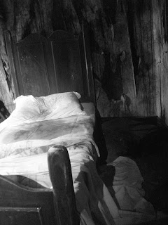
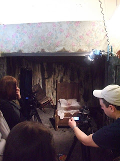
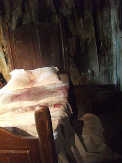
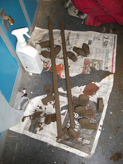
I chose a few of my favourite images and played about with them to give them a different effect. Im very pleased with how they came out.
Creative Arts for Theatre and Film. The Creation of Metaphoric Space
This blog will act as a journal and research area to store all my findings and processes for the unit 'The Creation of Metaphoric Space' focusing on the book 'The Metamorphism; by Frank Kafka
Thursday, 26 May 2011
Finished Set. 26/5/2011
Today was the final day of the project where we had to photograph everything. Not only did we take still images but we also videoed our rooms from different perspectives.We had a great time doing and we was extremely happy with our final outcome and the photos and videos that were taken.
We was shown different lighting positions using main 650 watt lights and junior lights to put in higher to reach areas. We were shown something called gels that are coloured pieces of plastic that are out over the light to create a different effect.
We laid out all the props on the table in the living room. We added tea in to the tea cups to make it look more realistic.
This is a shot of gregors room. I was so impressed when i first see this, there was cuttings of hair all over the floor and dust throughout.
Gregors blazer jacket was hanging behind the door in gregors room as it would have belonged to him before he turned in to a bug,
This is the coffee table that i did placed in the front of the fire with the whisky bottle, glass and book on it.
The windows in the living room
The fireplace in the living room with props.
Dining table with props
We was shown different lighting positions using main 650 watt lights and junior lights to put in higher to reach areas. We were shown something called gels that are coloured pieces of plastic that are out over the light to create a different effect.
Gregors room
i took photos from different points in the room. I took this nearer the ground to show it from gregors perspective as a bug.
This is one of my favourite images of gregors room as the light shining through the window on to gregors bed is really effective.
This is a great image of gregors desk with the props. Im really proud of my frame with the image of a women in.It works really well in the room.
Adam was playing around with lighting in the bedroom and i captured this image and i think the lighting on the wall looks really good.
We used a smoke machine to create an eerie effect in the bedroom. We added a blue gel to the light that came through the window and showed the smoke.
The light fitting on the wall didnt have real lights in so we attached a junior light to the wall above the fixture and attached an orange gel to represent a flickering light on to the dining table.It creates a really good effect
we took this image of the blue light shining through the crack in the door. It creates an amazing eerie effect.
This is another favourite image of mine. we used the smoke machine and blue light and aimed it towards the crack in the door.It gives the feeling that there is something in there that should not come out but is raging to want to get out.
Wednesday, 25 May 2011
Room 1408
These are images from the film 1408. The set changes alot throughout the film as the room is supposed to have a mind of its own. The images show what the rooms does, with the cracks in the wall and parts of the room burning up. Adds a great effect, the same sort of effect we are aiming for in our 2 rooms
Film Sets
This is an image of the set from the film sweeney todd. The film has quite a dark feel about it so the interior is very dull and strange. The curtains on the windows aswell as the flooring and wallpaper are similar to what we have done for our set.
Monday, 23 May 2011
Film Review
Reviews of Psychological horror in the films, Rear Window, The Shining, The Haunting and The Machinist for the unit ‘The Creation of Metaphoric Space;
For this unit, The Creation of metaphoric space, we watched a variety of films involving psychological horror that I will be reviewing in this essay.
The film rear window, directed by Alfred Hitchcock, was one of the first films we watched. The main story line of the film is about a man who has broken his leg so he is confined to his apartment where he has a large back window where he can see what his neighbours get up to. As time progresses he starts to get more and more distracted by his neighbour’s activities that he spots what he thinks a man who murders his wife but the he is unable to convince the police of this. He has a beautiful girlfriend who will do anything for him but to begin with his unsure of whether she is right for him. At this point in the film I notice that the 'man gaze' occurs quite frequently. The camera focuses quite closely on the women as she comes in to the apartment and prepares dinner for her man. The camera appears at different angles like the camera is looking through the man’s own eyes. The film doesn’t go to any other scenes apart from in his apartment and into the windows and back gardens of neighbour’s houses through the windows. When his girlfriend ventures into this mans house to find evidence that he killed his wife, it soon becomes quite terrifying as he cannot help her to escape, and therefore she is caught by the man. This contains the element of psychological horror as you don’t know what is going to happen. The man soon learns a valuable lesson towards the end of the film, not to mess with other peoples business as the man who is suspected of murdering his wife finally sees that he is being watched and throws the man out the window before falling and breaking both legs again,. It turns out that at the end the man did kill his wife; she was buried underneath the flowers in his garden which the neighbour’s dog kept trying to dig up. Although the film didn’t venture outside of four walls the film manages to keep your attention just so you can witness the final outcome. According to a film review on the website rotten tomatoes, another critic who also watched the film thinks ‘the film surely remains one of the most memorable and downright essential examples of the slow-burn thriller genre’ ( rotten tomatoes, 2011)
The Shining was the next film we watched, I watched the Shining for the first time, I found it fascinating as though looking at it through creative eyes but I did not like the story. There were certain scenes that I really liked and thought could work well for our set design involving psychological horror. There was a scene at the beginning there was a flood of blood into the hallway and I found this quite effective. The film is a great combination of the supernatural, crazy murders and insanity, according to a review on the website rotten tomatoes ‘Ostensibly a haunted house story, it manages to traverse a complex world of incipient madness, spectral murder and supernatural visions... and also makes you jump’ (Rotten tomatoes, 2011). We spoke about the shining in a theory lecture and spoke about the ID, EGO and SUPEREGO that is present in this film as well as others and I found this extremely interesting. I started to think more about other psychological horrors that could help towards the process of deciding what sets to make. Some of the camera angles that were used in the film to focus on certain characters faces when something frightening was happening added to the element of psychological horror that possessed the main character throughout the film. The most popular scene of the film where Johnny hacks his way through the door and says, ‘here’s Johnny!’ (The Shining, 1980) is one of the most popular horror scenes of all time.
The 1960’s version of The Haunting was the next film that I watched. At the beginning the narrator makes a very in depth description of the house, explaining that is haunted and unexplored. The music and the opening titles work well with the eerie image of a haunted house in the background. The furniture and the layout of the rooms in the house look normal, like it still for everyday use, but no one is living there or has lived there for a long time. So the idea that there is something there that they have experienced but cannot see adds to the psychological horror. The very decorative interior of the house shows the original residents must have been wealthy. The loud noises and ghostly goings on that is experienced by the visitors of the house, and that there is no visible reason as to why it is happening creates an eerie feel for the viewer. The camera also zooms in a lot in to specific areas, like something is supposed to be occupying that area creates a very strange feeling for the viewer that makes you wonder what is going on? Why is it happening? And the main question who is doing it? These are the main elements of psychological horror. According to a film review on the Rotten Tomatoes website, another film critic also thinks that the film has‘ A dark brooding atmosphere, disturbing psychological insights and a handful of suddenly executed surprises make this old horror as fresh and vital as the day it was made. (Rotten Tomatoes, 2011)
The last film I watched was ‘The Machinist’. The beginning is very strange. It starts with the main character rolling a man in a carpet down a hill in to a river and then switches to him a few different scenes that are all un related. It creates a lot of confusion to begin with but starts the ball rolling for the involvement of psychological horror. The main character has some kind of disorder that is unexplained throughout the film. He hasn’t slept for a year and things in every day life keeping messing with his mind. He is a very skinny man that weighs himself everyday and he gets lighter and lighter, he tries to find very odd things to do to keep him self busy as he can’t sleep. The element of psychological horror in this film is the characters mental state throughout the film, taking him to bizarre thoughts and incidents that are occurring all around him, involved in a usual everyday setting with Trevor, the main character getting caught up in odd situations. He leaves post it notes around his house and the main one that keeps within the viewers mind says ‘who are you’ (The Machinist, 2004) which is what the character is trying to explore throughout the film. The characters house is very small and dingy like it is unlived in that expresses a very creepy feel. According to a film review on the Rotten Tomatoes website, a film critic also thinks that ‘with time as a buffer, it's now easier to see The Machinist for what it is: a labyrinthine leap down the rabbit hole into a nightmarish wonderland’ (Rotten Tomatoes, 2011)
One scene that creates a very strange feel is where Trevor goes through a ride simulation which relates to what has happened in his life. He soon works out that he was involved in a hit and run incident that he has tried to block out of his life but it has come back to haunt him. The film dives deep in to the viewers mind to create its own psychological terror, the terror is not put right in front of your face as it is something you have to work out for yourself which really creates a sense of horror more than any other type of film can.
Bibliography
- Review of Rear Window - 1995-present, Rotten Tomatoes, http://www.rottentomatoes.com/m/1017289-rear_window/, date accessed 23/05/2011
- Review of The shining - 1995-present, Rotten Tomatoes, http://www.rottentomatoes.com/m/shining/, date accessed 23/05/2011
- Review of The Haunting - 1995-present, Rotten Tomatoes, http://www.rottentomatoes.com/m/1009277-haunting/, date accessed 23/05/2011
- Review of The Machinist - 1995-present, Rotten Tomatoes, http://www.rottentomatoes.com/m/machinist/, accessed 23/05/2011
Illustration List
- Fig 1, Rear Window - http://walrussinclair.blogspot.com/2011/04/rear-window.html, date accessed 23/05/2011
- Fig 2, The Shining - http://sartorialmale.com/featured/get-the-look-halloween/, date accessed 23/05/2011
- Fig 3, The Haunting - http://www.dvddrive-in.com/reviews/e-h/haunting1963.htm, date accessed 23/05/2011
- Fig 4, The Machinist -http://uk.movies.ign.com/articles/393/393239p1.html, date accessed 23/05/2011
19/05/2011
I came in to uni on thursday to find that so much had been done! it was amazing really. John was in the progress of distressing the wallpaper using a mixture of brown paint and water that he then put a piece of blue roll into and all excess squeezed out.This was then wiped over the wallpaper so that it gave it a discoloured look to the wallpaper. We continued to do this on all the wallpaper in the living room until it was covered. I then went on to help Jo paint her curtain poles with a dark brown paint which I also used to paint the skirting board so that a majority of the wood in the 2 rooms so that it all went on with a similar theme. Me and sarah also painted the ply wood that would be used for the roof in the same brown paint, but we watered it down alot so it covered more area and had messy effect to it to match the effect in gregors room. I managed to sort through the props that i had made and also bought. Jess mentioned that we needed other props for around the fireplace but it was very difficult to come across anything that was a reasonable price.
I have really enjoyed working on this unit as well as working in a group with some great people. The last few weeks I havent been able to get in to uni much but the times i have been in i have tried my hardest to put as much effort as i possibly can in to helping everyone out. The photos will be taken on thursday and I cant wait to see how they turn out.
I have really enjoyed working on this unit as well as working in a group with some great people. The last few weeks I havent been able to get in to uni much but the times i have been in i have tried my hardest to put as much effort as i possibly can in to helping everyone out. The photos will be taken on thursday and I cant wait to see how they turn out.
This is the desk that sarah made with the scratches in the top.It is awesome, i really like what she has done with it!
This is the dining table for the living room that eleanor created
Gregors room, the walls were created by using a mixture of brown paint and tissue stuck to the walls underneath the wallpaper that was applied over the top. The wallpaper was then ripped to reveal the underneath
The discoloured wallpaper that me and john distressed
the doors being made for the living room
The fireplace for the living room that emily created.
ben and jess painted the floor which carpet will then be put on top of it with ripped parts to reveal the floor underneath.
The doors created by stuart, adam and others helping out, using a variety of tools to create the scratches in the door to resemble gregor scratching at it.
The window frames that karen was creating
The process of the bed being made by emma.
light fittings that were distressed by jess, this one is to be put in gregors room.
me, sarah and hannah were painting the skirting boards that were measured pieces of wood, that were then routed around the top. We then painted in a dark brown colour.
The curtails rails and hooks made by Jo that i helped her to paint.
The sofa for gregors room that was made by adam
The ply wood for the roof that me and sarah painted.
Subscribe to:
Comments (Atom)


